> ## Documentation Index
> Fetch the complete documentation index at: https://anaconda.com/docs/llms.txt
> Use this file to discover all available pages before exploring further.
# Visualize with Python
Visualizations allow you to transform entire data sheets or specific cell selections into charts to help you understand your data. Anaconda provides a variety of charts so you can present your data in a way that makes sense for your use case.
## Creating a chart
Create a new chart using the following steps:
1. Under **Visualizations**, click **Visualize with Python**.
2. Click **+ New Chart**.
3. Select a chart type from the list of charts.
4. Select your source data range and configure the controls on the **Setup** tab.
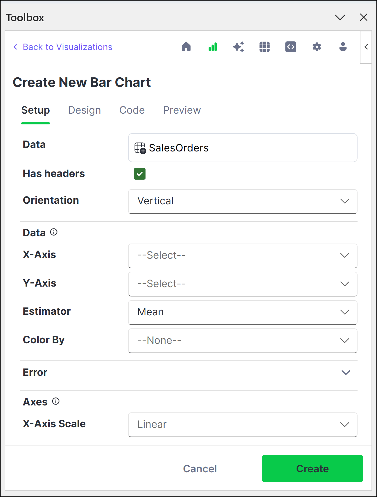 5. (Optional) Customize your chart further with the options provided on the **Design** tab.
6. Click **Create**.
7. Set the location for the chart to render, then click **OK**. The chart renders within the confines of the cell.
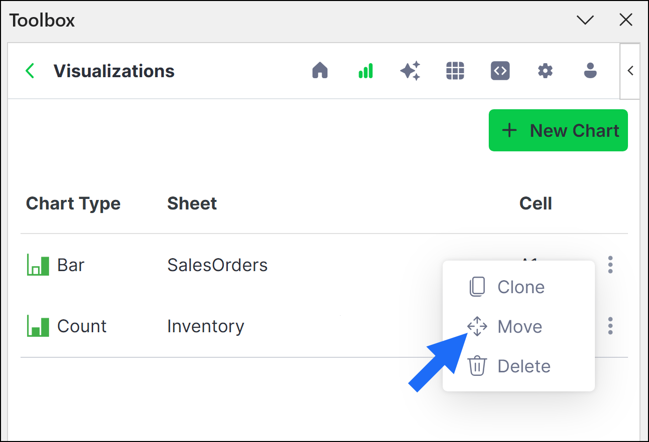
To move a chart to a new cell after creating it, click actions beside the chart, then click **Move**.
5. (Optional) Customize your chart further with the options provided on the **Design** tab.
6. Click **Create**.
7. Set the location for the chart to render, then click **OK**. The chart renders within the confines of the cell.
To move a chart to a new cell after creating it, click actions beside the chart, then click **Move**.
 8. To properly view the chart, select the cell, then click **Create Reference**.
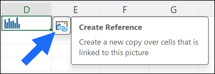 The chart displays as an enlarged copy. If you'd prefer to view the enlarged chart only when needed, you can delete the enlarged copy and recreate it at any time.
## Editing a chart
Edit an existing chart by adjusting the parameters provided on the **Setup** and **Design** tabs or by manually configuring the code on the **Code** tab.
1. From the Visualizations home page, click the chart you want to edit.
The chart displays as an enlarged copy. If you'd prefer to view the enlarged chart only when needed, you can delete the enlarged copy and recreate it at any time.
## Editing a chart
Edit an existing chart by adjusting the parameters provided on the **Setup** and **Design** tabs or by manually configuring the code on the **Code** tab.
1. From the Visualizations home page, click the chart you want to edit.
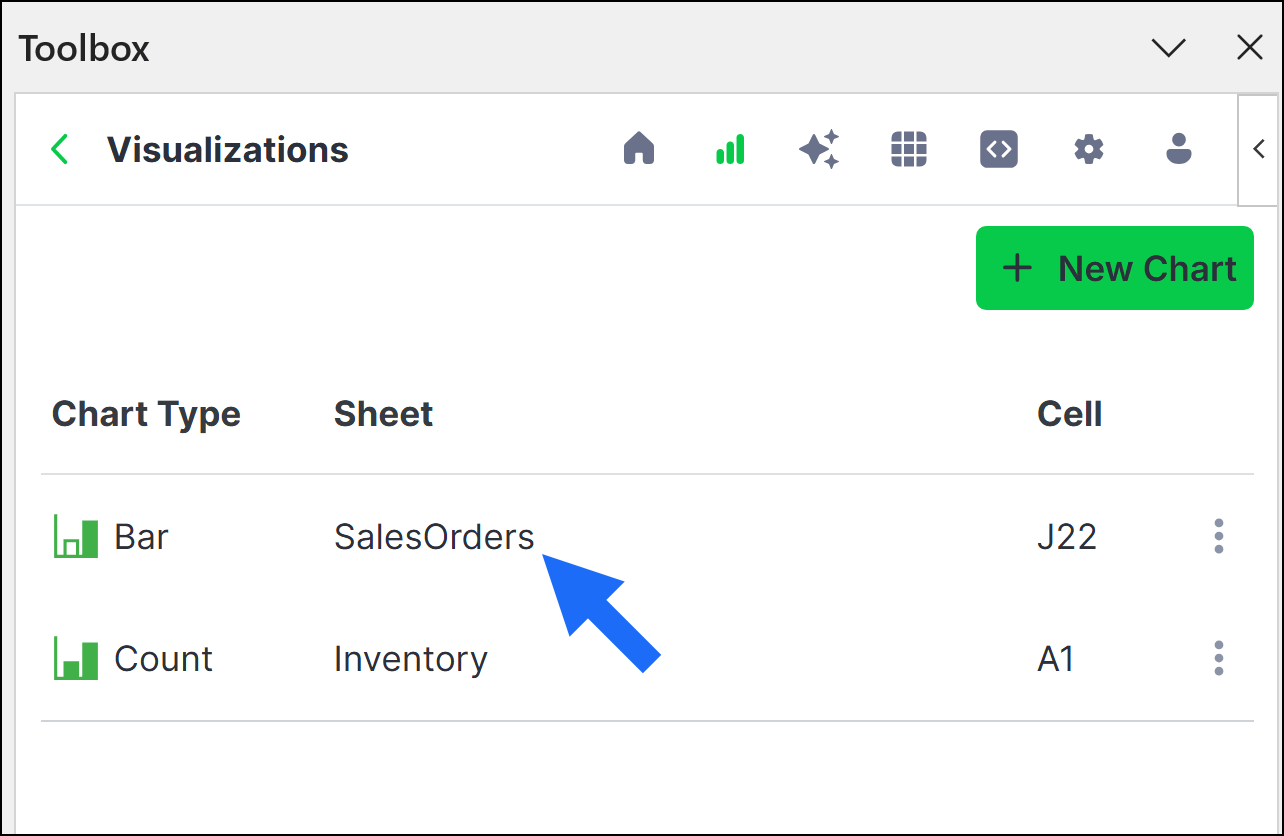 2. Make any necessary changes on the **Setup** and **Design** tabs, then click **Apply**.
The **Code** tab displays auto-generated code based on your selections in the **Setup** and **Design** tabs. While the tabs offer numerous configuration options, the underlying Python library, seaborn, offers additional flexibility, as detailed in the seaborn [API documentation](https://seaborn.pydata.org/api#function-interface).
To take advantage of this flexibility:
1. From the Visualizations home page, click the chart you want to edit.
2. Click the **Code** tab.
3. Enter **Edit** mode.
4. Make any necessary changes to the code, then click **Apply**.
While you are in **Edit** mode, the **Setup** and **Design** tabs become locked because free-form code changes cannot be reflected back to the UI elements in the **Setup** and **Design** tabs.
Once you edit a chart's code manually, you cannot return to using the **Setup** and **Design** tabs to configure your chart without first discarding all of the changes you've made to the chart's code. The reason is that the **Setup** and **Design** tabs will again auto-generate code and overwrite any existing code in the **Code** tab.
2. Make any necessary changes on the **Setup** and **Design** tabs, then click **Apply**.
The **Code** tab displays auto-generated code based on your selections in the **Setup** and **Design** tabs. While the tabs offer numerous configuration options, the underlying Python library, seaborn, offers additional flexibility, as detailed in the seaborn [API documentation](https://seaborn.pydata.org/api#function-interface).
To take advantage of this flexibility:
1. From the Visualizations home page, click the chart you want to edit.
2. Click the **Code** tab.
3. Enter **Edit** mode.
4. Make any necessary changes to the code, then click **Apply**.
While you are in **Edit** mode, the **Setup** and **Design** tabs become locked because free-form code changes cannot be reflected back to the UI elements in the **Setup** and **Design** tabs.
Once you edit a chart's code manually, you cannot return to using the **Setup** and **Design** tabs to configure your chart without first discarding all of the changes you've made to the chart's code. The reason is that the **Setup** and **Design** tabs will again auto-generate code and overwrite any existing code in the **Code** tab.